The Card is one of the most commonly used visualizations in Power BI for displaying KPIs and key metrics in a clear, decision-oriented way.
A Closer Look at the New Power BI Card Visual in General Availability
1. Executive summary
The new "Card" visual in Power BI has reached General Availability (GA), featuring advanced improvements in design, layout, performance, and usability.
This release transforms the way critical KPIs are presented, expanding customization options, incorporating images, introducing new modern styles, and featuring a flexible visual architecture that makes it easier to tell data stories.
The new Power BI Card visual is designed to display key metrics clearly and concisely, making it easier to read critical indicators on executive and operational dashboards.
This type of visual is particularly useful when you need to highlight a single key metric—such as total sales, margin, number of customers, or performance indicators—without overloading the report with complex visual elements.
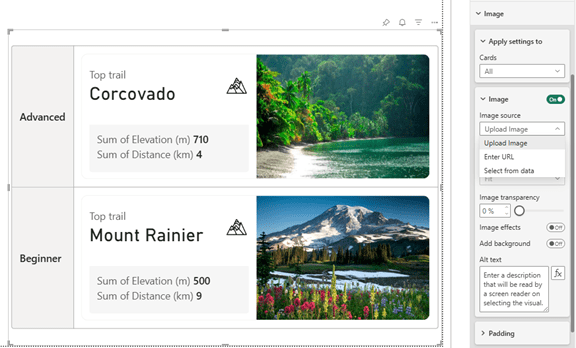
Image New visual card
2. Context / Background
The Card visual has historically been one of the central elements in Power BI dashboards, especially for displaying key values such as totals, averages, financial KPIs, operational metrics, or health indicators.
This new version follows months of community feedback and a public preview period.
The update is not just a simple redesign: it introduces a completely revamped visual model that aligns with Power BI’s new visual system.
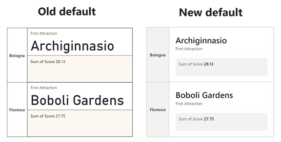
Comparative image between old and new Card
3. Main developments
1. Image integration
Allows you to include representative images in the visual, from icons to photographs of products, areas, or KPIs.
These images can be uploaded from your computer, a URL, or data fields.
2. New default visual style
It includes updated fonts, optimized spacing, shadows, layers, and a better-integrated color palette.
3. Advanced layouts
The new "collage" mode allows for intelligent composition that prioritizes one part of the card while distributing the others.
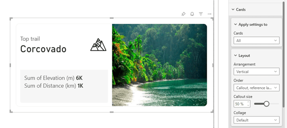
Example image on Card
4. Full control of order and visibility of elements
The user can rearrange titles, values, images, and labels by simply dragging them.
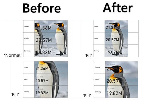
5. Significant technical improvements
- Removal of excessive padding .
- Better performance with autogrid.
- Optimized alignment.
- Correction of backgrounds with partial images.
6. Compatibility with existing reports
The old visual remains available—albeit hidden—and can be retrieved if necessary.
4. Key advantages
- Greater visual impact of corporate KPIs.
- Expansion of storytelling within the report.
- A better understanding of metrics for executive users.
- More modern dashboards with their own visual identity.
- Full integration with custom corporate themes.
Visual card applied to a real KPI
5. Practical use cases
- Hospitals: hospital occupancy, bed turnover, waiting lists.
- Industrial: scrap, OEE, production per line, energy consumption.
- Retail: average ticket, conversion rate, sales per hour.
- Finance: EBITDA, cash flow, forecast vs. actual, variances.
Example of use in industrial panel
6. Recommendations for adoption
- Enable the new visual theme in development environments.
- Review and align the color palette with the corporate identity.
- Determine which KPIs should include images.
- Test performance on mobile devices, tablets, and ultra-wide screens.
- Ensure visual consistency with the other dashboards.
- Apply governance by documenting which KPIs Card will use and for what purpose.
7. Implications for corporate projects
The introduction of the new Card visual allows organizations that rely heavily on dashboards—such as finance departments, hospitals, and industrial or commercial divisions—to create clearer dashboards that are more widely adopted by end users.
This new visual approach brings Power BI in line with the modern standards of premium platforms such as Tableau and Looker, reinforcing its position as a leading tool for data storytelling.
8. Implications for corporate projects
The new Power BI Card visual is particularly recommended for scenarios such as:
- Management dashboards featuring key performance indicators (KPIs).
- Financial or business reports that need to be read quickly.
- Operational dashboards that prioritize visual simplicity.
- Reports shared with non-technical users.
Proper use of this visual aids in understanding the data and supports decision-making based on clear and accessible information.
9. Conclusion
The Card visualization is evolving into a new standard of quality within Power BI, offering a richer, more modern, customizable, and powerful experience.
We recommend implementing this change gradually to fully leverage its aesthetic and functional improvements, whether in existing panels or new installations.
10. Sources and Bibliography
- Original news item: https://powerbi.microsoft.com/en-us/blog/deep-dive-into-the-new-card-visual-in-reports-generally-available/
- Official documentation: https://learn.microsoft.com/power-bi
- Examples of modern visuals:https://powerbi.microsoft.com/blog