

Power BI now includes Markers in Azure Maps, a new feature that allows you to create much more expressive and business-oriented interactive maps without having to rely on complex GIS tools.
With the new Markers in Power BI, organizations can significantly improve the geospatial visualization of their data, making it easier to interpret information related to logistics, retail, operations, and land-use planning.
What do the new markers in Power BI offer?
Markers in Power BI represent a major advancement in geospatial visualization, as they allow you to distinguish points of interest using custom icons or images, replacing traditional static circles.
This approach provides immediate visual context:
- A store can be represented by its own logo.
- A delivery marked with a truck icon.
- An incident accompanied by a visual warning.
- A warehouse with a specific pictogram.
In addition, Markers allow you to work with dynamic variations by adjusting:
- Icon size based on metrics (sales, volume, incidents).
- Colors and conditional formatting.
- Slides and other visual elements.
Adding markers in Power BI transforms traditional dashboards into smarter, interactive maps.
Key benefits and real-world use cases by industry
From a business perspective, this functionality opens up a wide range of real-world use cases.
- In logistics and supply chain environments, delivery routes and shipment volumes can be visualized using truck icons that automatically change size based on the volume being transported.
- In the field of operations and utilities, Markers allow you to represent different types of assets, operational statuses, or incidents using specific icons and conditional formatting.
- In sectors such as retail and distribution, store types or performance levels can be differentiated using different icons and colors, quickly highlighting the best and worst performers by region.

This type of advanced visualization in Power BI makes it easier to identify trends, opportunities, and risks in real time.
Multilayer Maps with Markers in Azure Maps
One of the key new features is the ability to combine the Markers layer with routes and points of interest from Azure Maps, creating multi-layer maps in Power BI.
This allows you to:
- display points, routes, and geographic boundaries simultaneously,
- analyze routes, zones, and locations all in one view.
To correctly represent the orientation of the markers, the data model must include the angle of each point, which allows the icons to be rotated dynamically (for example, the direction of a vehicle).
How to Start Using Markers in Power BI
To integrate Markers into Power BI, simply:
- Create an Azure Maps visual in Power BI Desktop or in the web service;
- add the latitude and longitude fields along with the route identifier;
- set the bullet type to an icon in the formatting panel;
- Adjust the size, color, and rotation using conditional formatting.
With this feature, maps are no longer static representations but become dynamic tools for visual analysis.
Conclusion
With the addition of Markers to Azure Maps, Power BI strengthens its position as a platform for advanced analytics and geospatial visualization, offering interactive maps tailored to real business needs.
Markers enable companies to:
- create clearer and more actionable dashboards ,
- improve understanding of geographic data,
- make decisions more quickly.
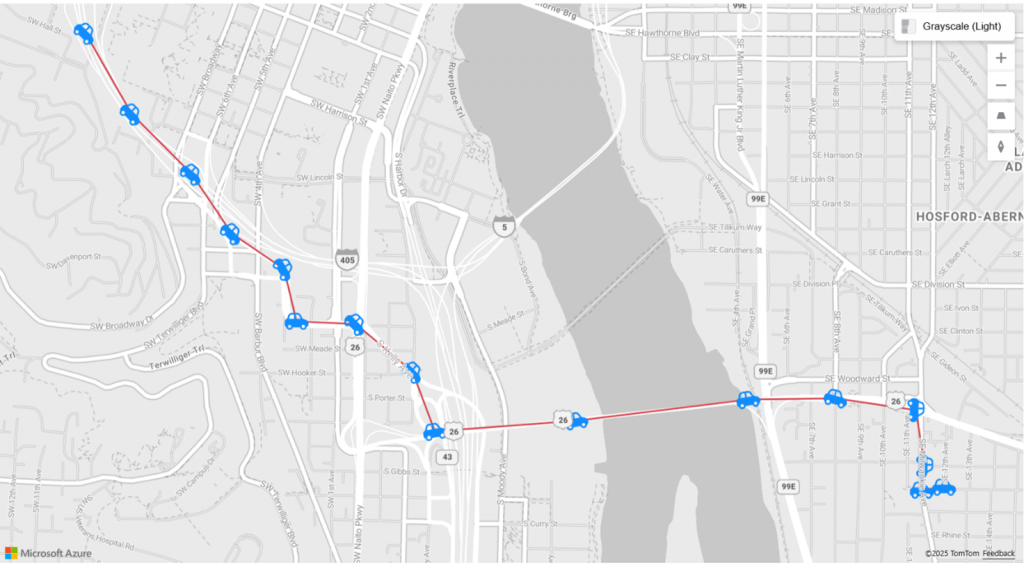
Image 1: Microsoft | Microsoft Power BI Blog (2026)